Description
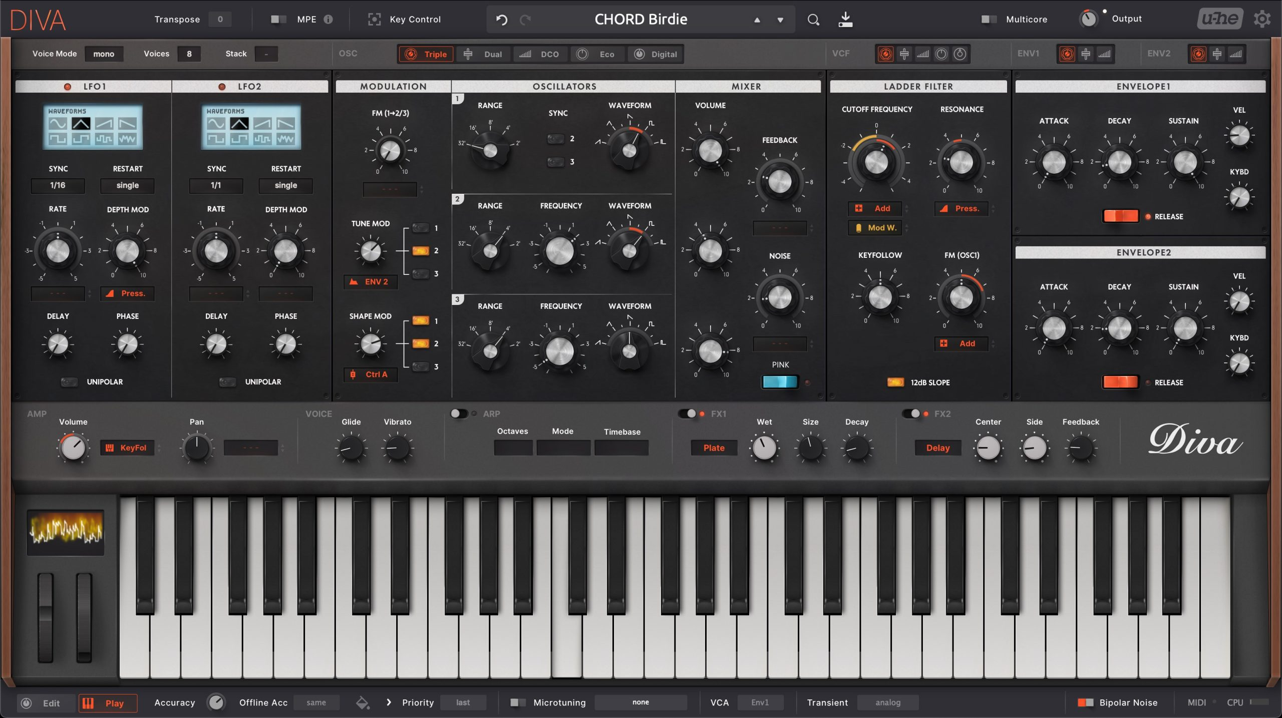
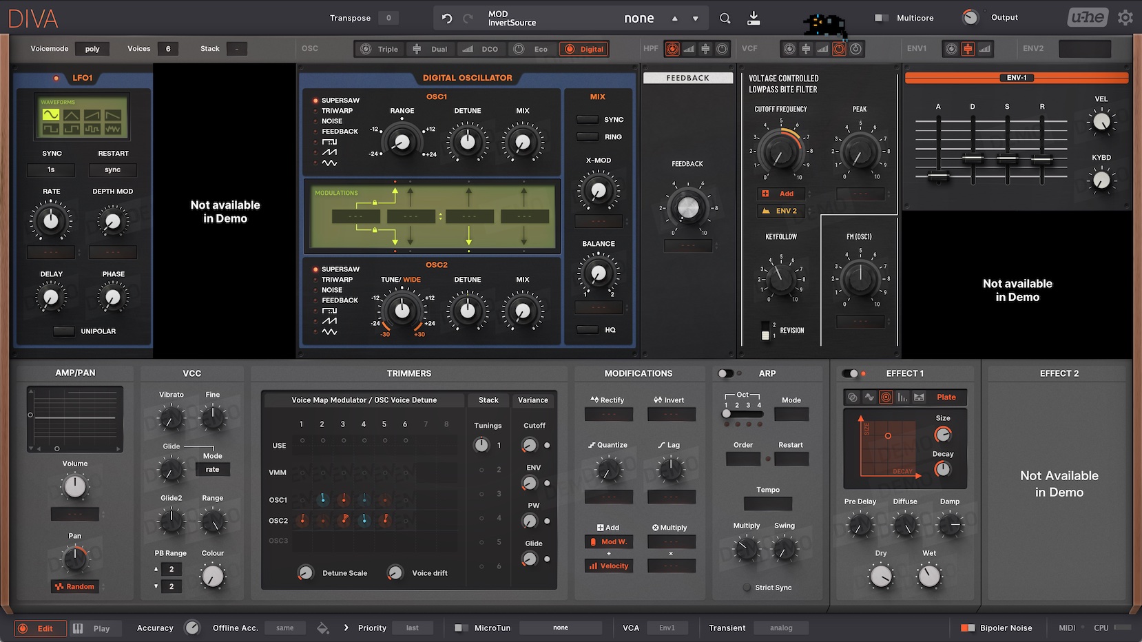
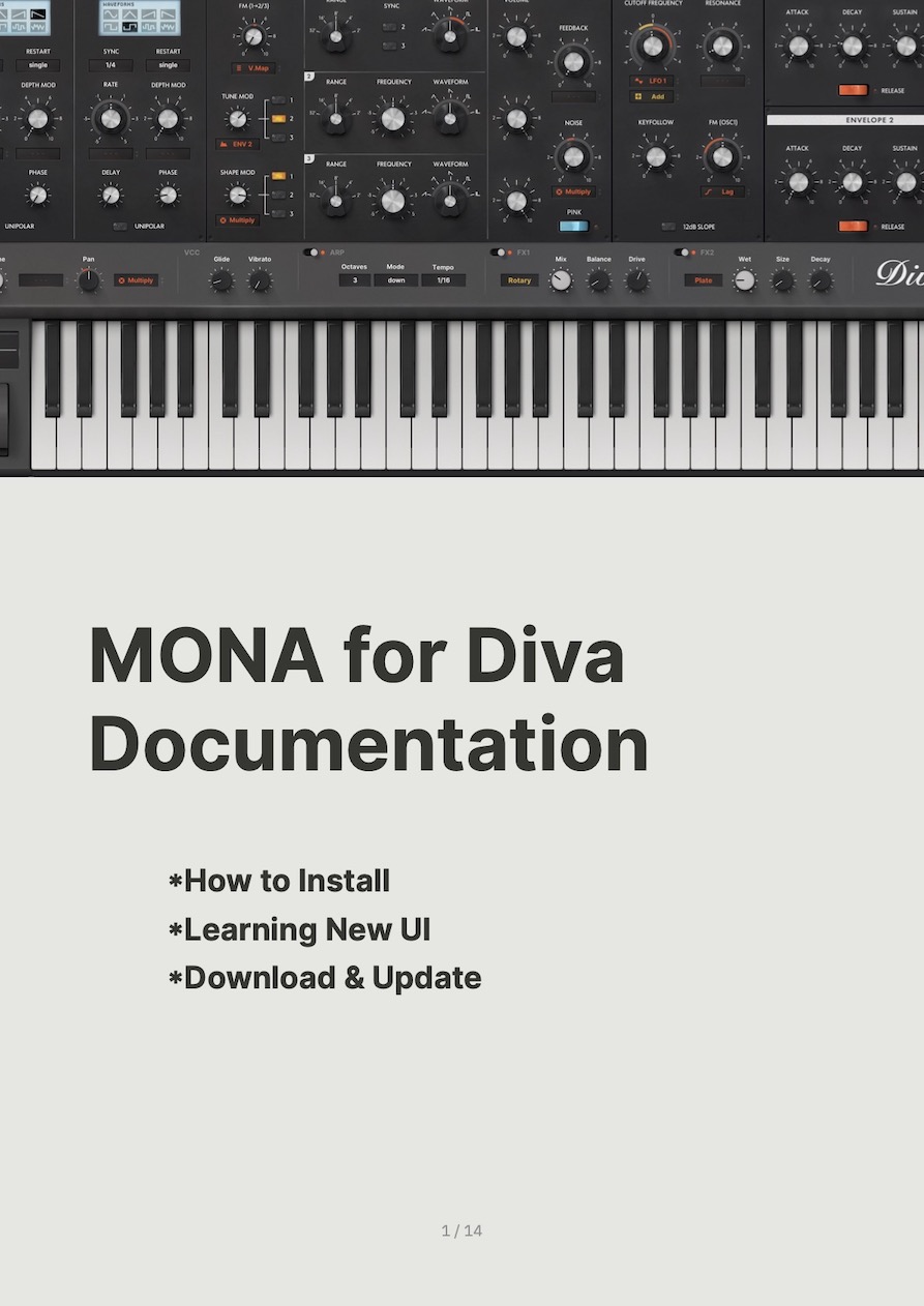
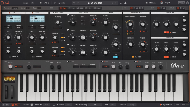
"MONA" is a custom GUI for u-he Diva. It changes not only how it looks, but also how it works.
Key Features
- 1660 x 930 huge GUI size
- Realistic hardware look
- Everything in 1 pane
- Playable keyboard and wheels
- The "Massive Modulation" system v2
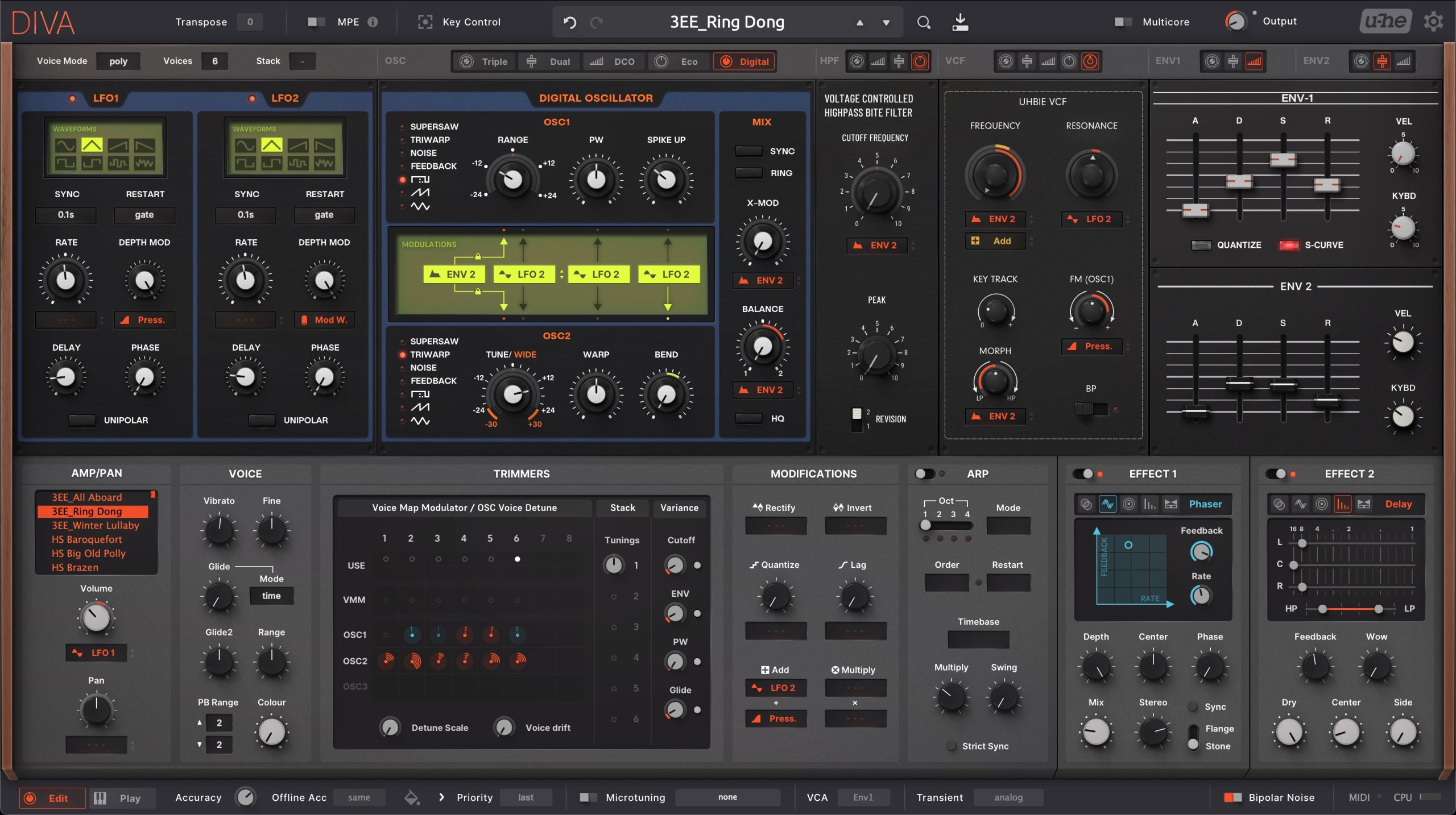
- One-click module switching
- XY controls for effects
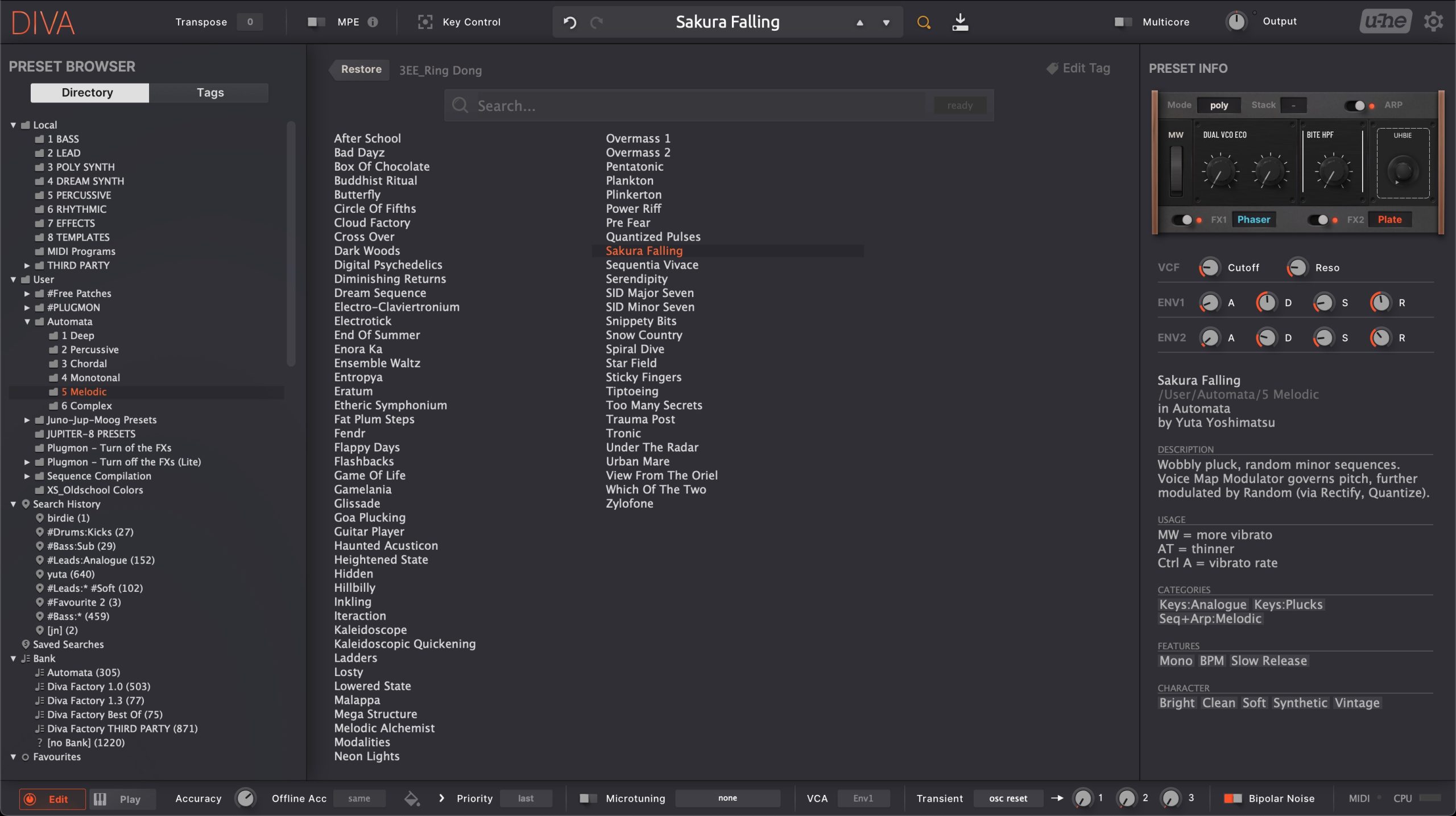
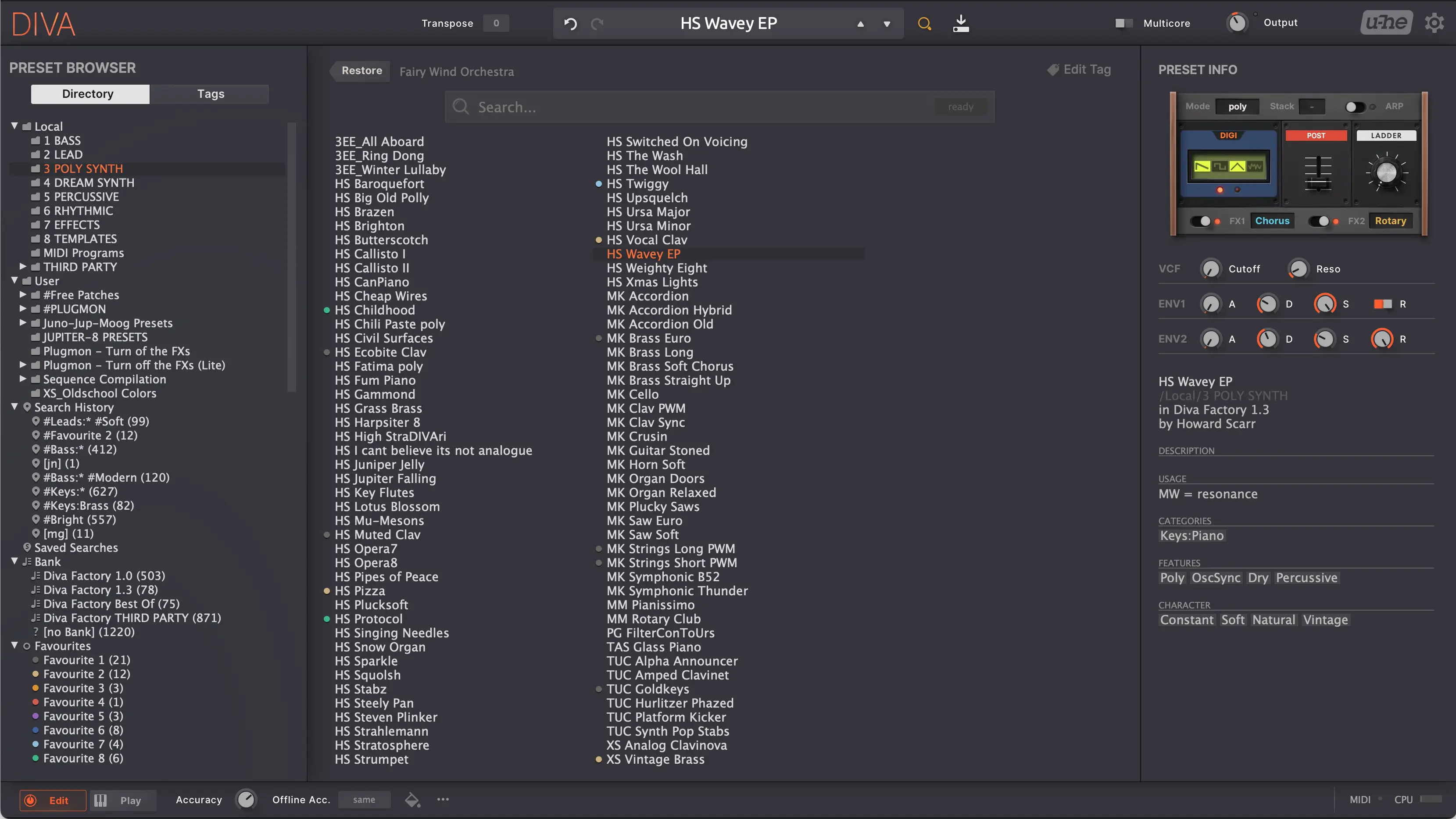
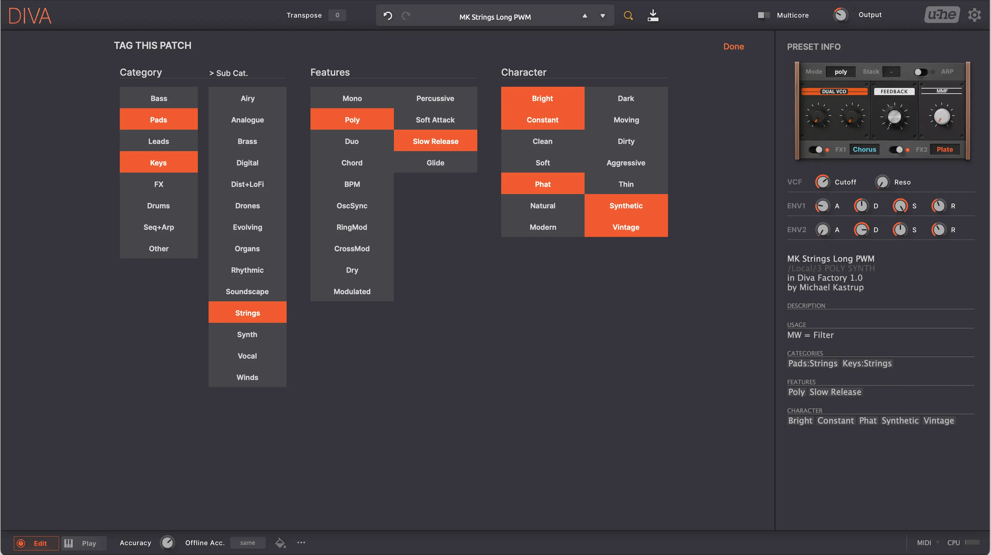
- "Easy Access" to essential parameters in browser
The new workflow improves your efficiency, and the beautiful appearance just makes you happy😇
"Massive Modulation" System v2
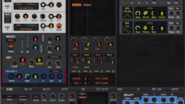
MONA has the new modulation system like NI Massive synth. The system is almost the same as the one in AIKO, but in this version (v2), icons are added and you can change mod sources by clicking these icons too! This is great when you don't feel like right-clicking. Choice is joy!
 Click : Set the mod source (if unset)
 Drag the text area : Control mod depth
 Right click: Change the mod source
 Click icons : Change the mod source
 Mod amount is shown as a ring.
Just have a try and you'll see. It's really simple and fit to your hand!
1-Click Model Selector
Just one click to change models. It's even draggable! How many times have you open the model selector pop-up menus? Your lifetime is finite. Halve your clicks with MONA.
Editor View
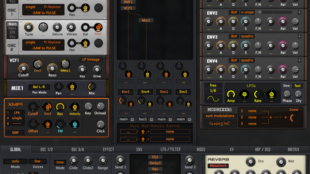
No tabs. All controls are in a single pane. Inactive parameters are hidden automatically, minor parameters are put in the footer, thus constructing a tidy environment where you can concentrate on sound making without getting annoyed by UI-wise tediousness.
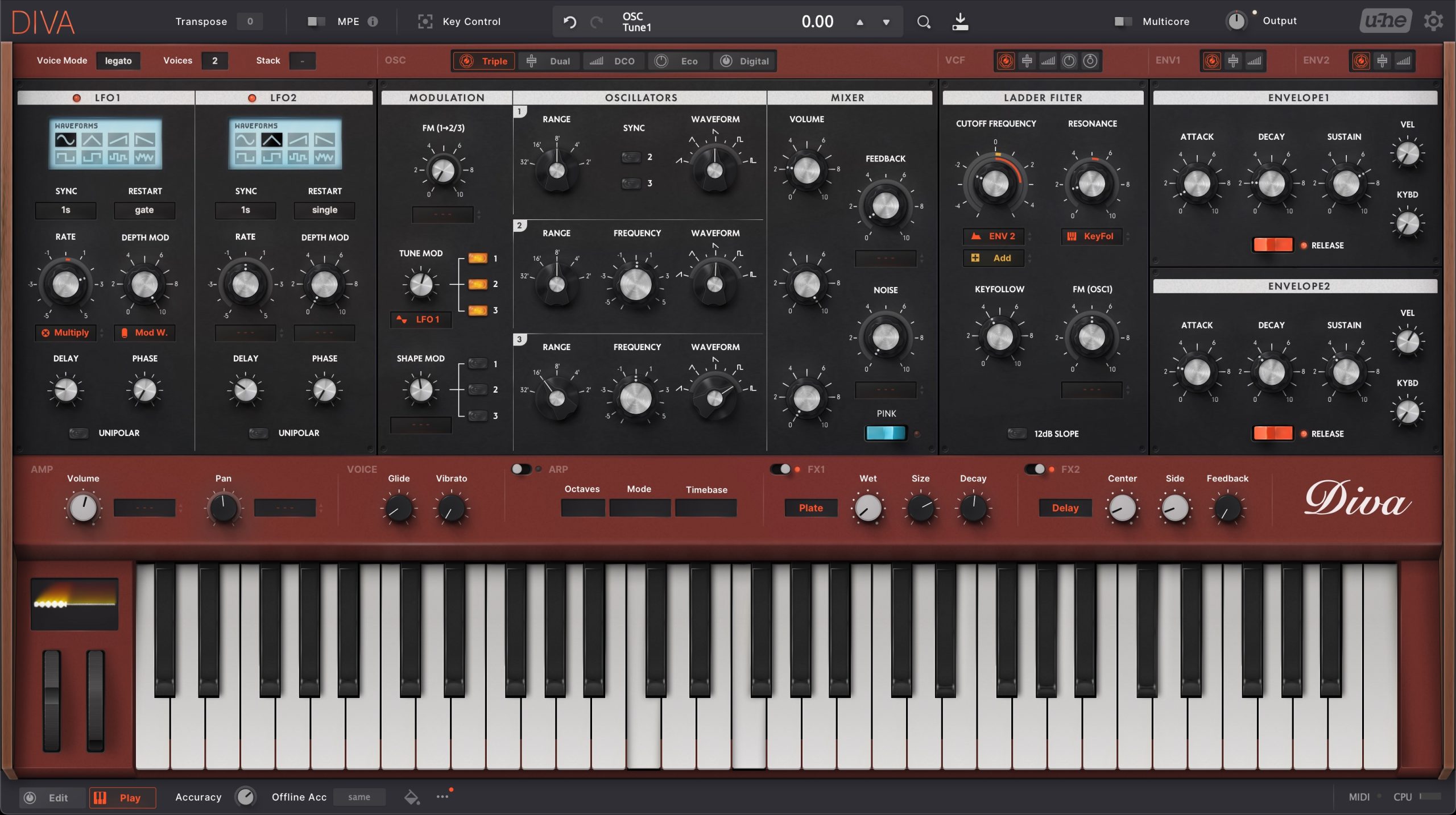
Player View
Hive is the first u-he synth equipped with wheels and a keyboard. As all u-he synths shares the same GUI system, now Diva (silently) gained the ability to have them in.
They work totally same as the ones in Hive––They react to MIDI written in DAW or hardware MIDI controllers. And you can click keys to play notes, drag wheels to check how MW/PW work.
Trailer Video



Fannon (verified owner) –
Quality Work like usual 🙂 The skin really helps to get a better, full overview of the synth state while also simplifying the UI, e.g. by the smart modulation system.
Luis Baldwin (verified owner) –
I usually force myself into liking the Default skin of any synth, because I try to judge the sound rather than the looks. But man, I really fell in love with Diva with this skin. Great work Plugmon!
Chris Sterling (verified owner) –
Give Diva a modern feel to craft sound. I’m so satisfy!!!
CGM (verified owner) –
Excellent work!!
Easy install and within seconds, creating new presets, definitely revitalising my love of Diva and taking to new heights – very highly recommended!
(Anonymous) (verified owner) –
The best-sounding plug-in synths now have the best look and feel of all plug-in synths. Thank you Plugmon. I love your work.
the-simian (verified owner) –
This is the UI that Dive should have had, and improved my mental model of its capabilities. Here’s a few things that made a big difference for me:
1. Moving the ‘drop down’ selects in the sections to tabs made me more likely to try other modes. The tabs are an easier way to see the tree-like structure of each panel.
2. the color-rings around the knobs give you way more visual feedback about what is being affected. The massive modulation system is quite an improvement.
3. The theme, being physically larger takes more advantage of modern monitors, showing more at once
I’ve already started using this on some new sounds on tracks on my soundcloud, and for me its been a masterclass in effective synth ui design. I don’t think I can go back to the previous skin after using this.
kirkwoodwest (verified owner) –
A great refresh to the classic Diva Synthesizer by U-HE. This totally modernizes the Diva Interface. Must Have.
Raphel Tucker (verified owner) –
U-he is a kingpin for digital synth quality. Unfortunately, their GUIs leave something to be desired. MONA completely fixes this for Diva, making it as user-friendly as Sylenth1 or Serum.
dBOxi (verified owner) –
This is more than facelift update for Diva. For example the preset browser of Diva is already good but Mona goes to the next level by including preset info with adjustments.
KuDa177 (verified owner) –
The workflow with this skin is a huge improvement overall. More clean, more intuitive and fresh looking.
TORLEY (verified owner) –
There are “skins”, and then there are “total transformations”. MONA is very much the latter — going beyond cosmetics to add improved functionality. I enjoyed AIKO years ago, but MONA outshines it in a number of respects, featuring a purposefully skeuomorphic, elegant layout that has me smiling when I’m diving in to the many Diva patches I have.
I like how the osc sections are structured, model selection is a one-click direct path, and other repetitive steps are folded into one. Even if you’re just browsing/tweaking sounds rather than creating them from scratch, this benefits your immediacy — in particular, the streamlined patch browser layout and being able to do PRESET adjustments right from there in a mini-display is so rewarding!
The sheer thoughtfulness of design AND cross-applying things from Hive is something U-he should seriously consider to bring Yuta Yoshimatsu’s PLUGMON magic aboard to their factory user interfaces.
If you play Diva and don’t have MONA, you’re missing out, big time. 🙌⏰
Nova (verified owner) –
MONA is absolutely brilliant and it’s refreshing to use. Very easy on the eyes, especially for long sound design sessions. Some of the parameters in the default DIVA GUI are quite tiny, even when the interface is enlarged. MONA is a huge improvement over the original and it eliminates excessive guesswork, most importantly if you come back to work on a patch the next day and need to pick up where you left off, this new GUI saves time. The trimmers tab is much more pleasant to look at, and it displays current settings in a much more immediate fashion. I rarely, if ever write reviews, but Plugmon’s efforts towards this GUI are simply too good to not acknowledge. Excellent work.
Carl Summers (verified owner) –
Exactly what Diva needed, a UI that’s straightforward, easy to understand and playable out of the box. I had Diva for a while and couldn’t wrap my head around it, but with this skin, I can understand its functionality almost immediately.
retcheto (verified owner) –
This is fantastic, the default Diva skin is not very good. I don’t see why we have to be stuck with ancient interfaces just because this is modeling analogue sounds. GUI design has improved a lot and this is not a hardware synth, why be limited by the graphical restrictions of hardware?
Mona solves a lot of that, it makes the modulation sources and amounts much easier to read. Things are laid out clearly, after only a few hours playing with this I can say it’s already so much better and easier to work with than the default skin. definitely recommended!
Pete Gunn (verified owner) –
Amazing work. This is more than a theme, its a total redesign of Diva. It really brings it into a more modern feel. At this point, i cannot even imagine diva any other way. it is an improvement to not only the aesthetic, but a great improvement to the workflow as well.
Peter Klingelhofer (verified owner) –
Brilliant. I’ve been using Diva for many years, but learned synths on Massive way back when. This combines the best of both worlds – the visual enhancement of the modulation system addresses Diva’s only real weakness (slightly clunky clicking through menus modulation), and the graphics themselves are absolutely divine. I’ve fallen in love with Diva all over again. Cannot recommend this enough.
Hannes Nüter (verified owner) –
WOW this is the best thing for DIVA !
thank you for the great work !!
Sonic (verified owner) –
I always found the Diva GUI somewhat confusing which prevented me from exploring further but this replacement skin is brilliant in that is displays the complex information in a clearer, more manageable way.
Great work. Thank you.
Basicnoise (verified owner) –
Really nice GUI. DIVA almost feels like a new synth now. In a very good way.
One thing I would love for a possible update: A dedicated knob for FreqMod. The function is there, yes, but with Cubase I can’t map it to my controller as the mapping assistant always selects FreqModSrc when I click on FreqMod. I can do it manually though by searching the (very long) list, map it to a quick control and then map the quick control to my controller. But this feels stupidly complicated. Normaly mapping a function is 2 clicks. “This” – should go “there”.
FER (verified owner) –
Best skin and hope Black Diva GUI soon! My sound presents are more deep
michael2105 (verified owner) –
Fabulous, totally happy
I might use Zebra 2 again just be able to use Neumann Pro. It is so good