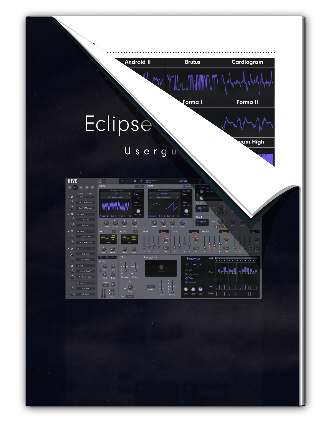
Description
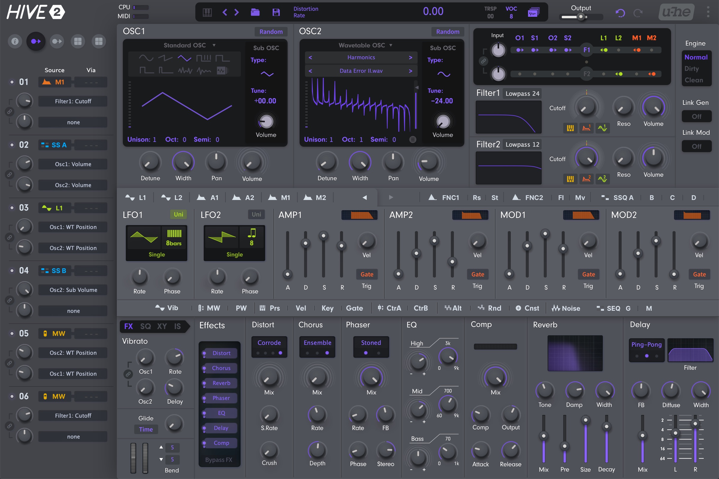
- Wavetable intended design
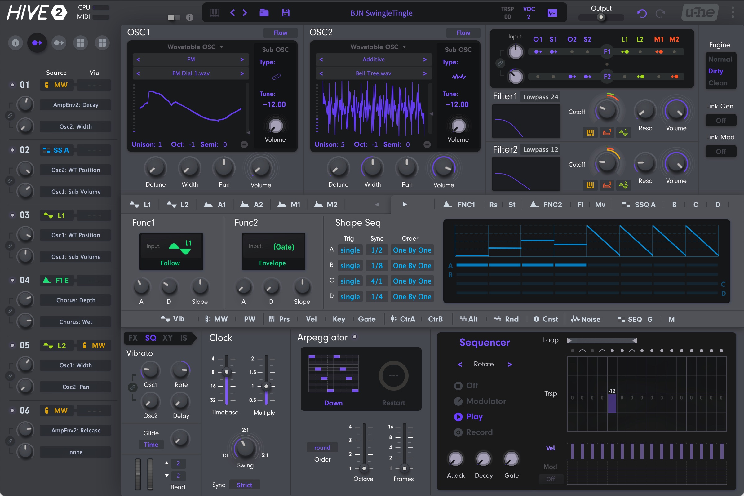
- Full space for SEQ/FX/XY
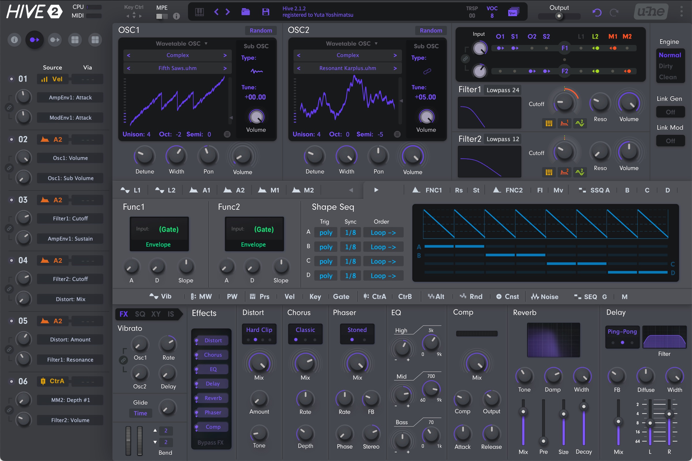
- Massive style modulation (for Filter)
- Partial module linking (Generators/Modulators)
- Additional "Linked Controls"
- Notify you of inactiveness in various ways
- Coordinated colors make MM clear
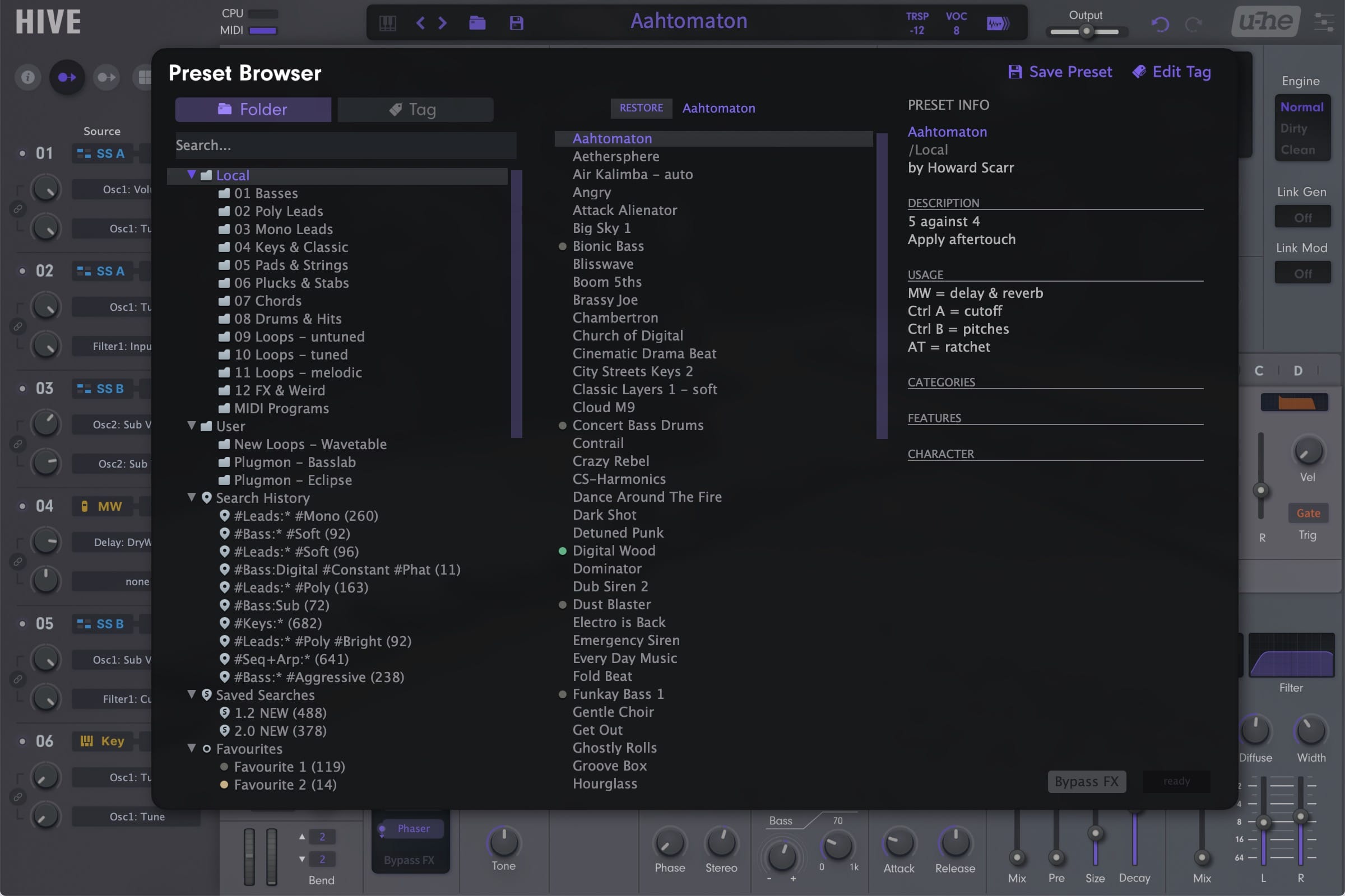
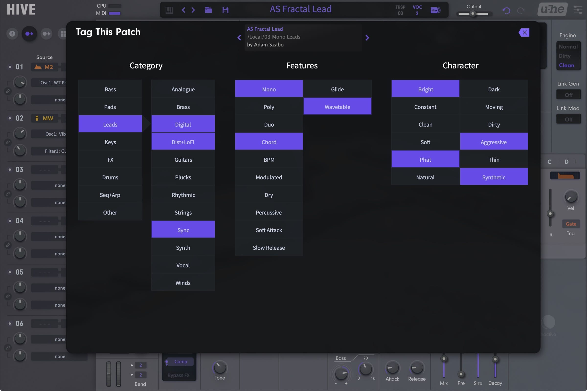
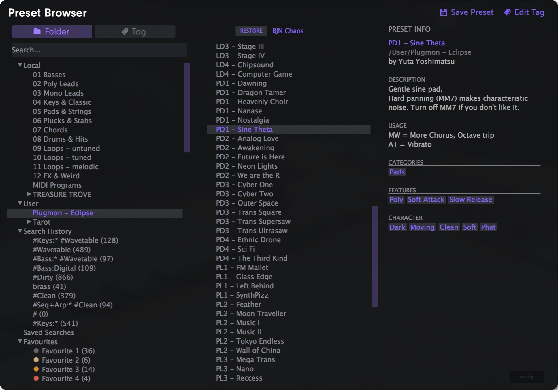
- Comes with presets and custom wavetables
⚠︎This skin is compatible with Hive 2.1, but the layout itself was created during the Hive 1 era. While compatibility updates are still ongoing, please understand that it is essentially a "Legacy" product.
Fly from Hexagon
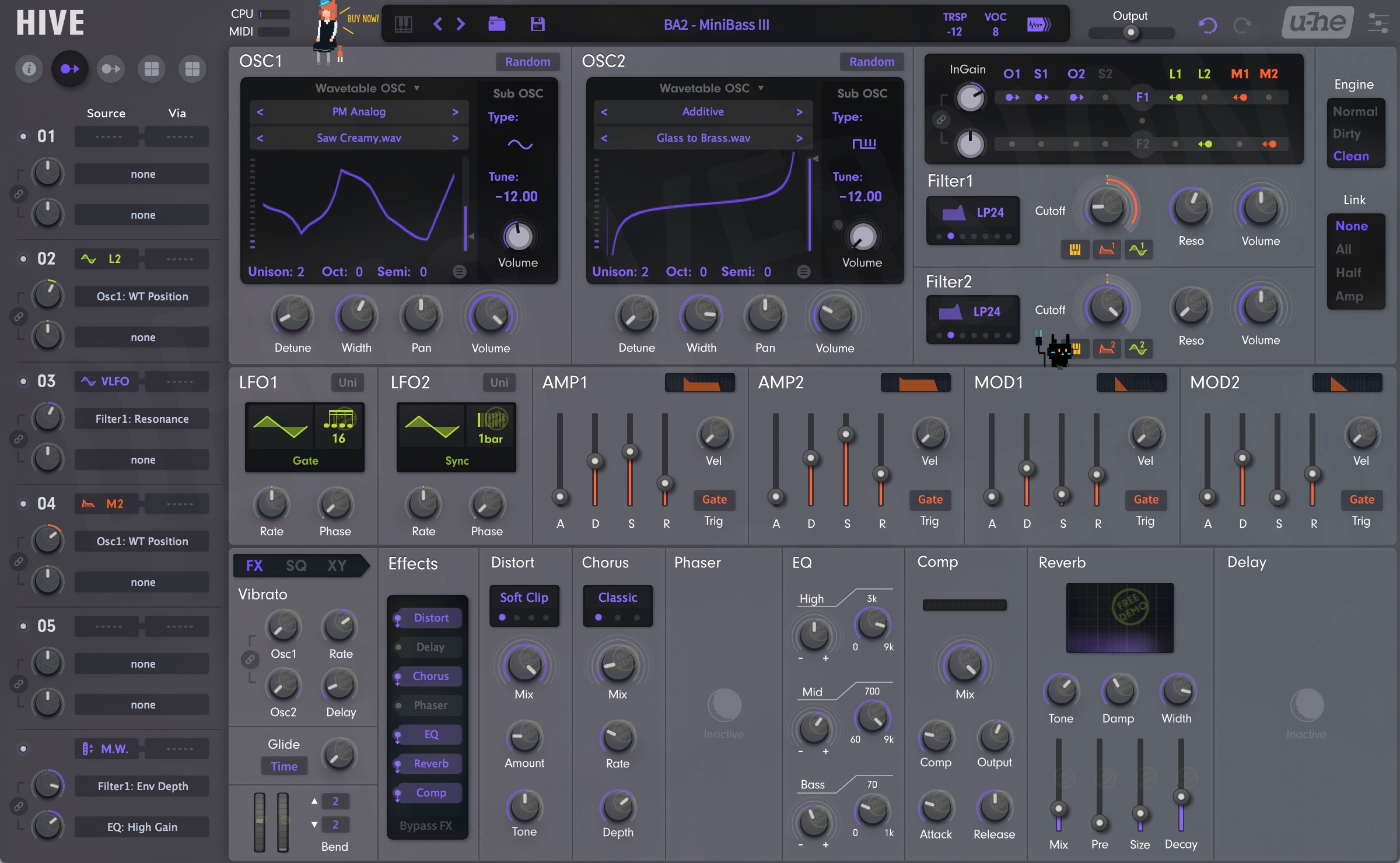
The central hexagon in the original skin symbolizes its name "Hive". So they seems to be sticking to it. But...
Because of the hexagon, you cannot see the 16 step sequencer stay in a single line.
Because of the hexagon, you cannot see the 7 great effects set in a single lane.
And because of the hexagon, you cannot see the 4 XY pads placed side by side.
Ok now, fly from your hexagon and start from square one.
Law of Friendship
What is efficiency and how do we improve it? There are many factors, but one definite measure is what I call friendship.
Say you just finish adjusting OSC1 volume, where will you go next? it is likely that you next edit OSC2 volume. Of-course it's not always so, but there on the average must be the ranking of probability.
I personally call this "friendship". OSC1 vol and OSC2 vol has great friendship, for example. Elements with higher friendship must be placed closer, so that your mouse movement will be minimized.
Below illustrates the area you have to move when mixing sounds (volume controls and filter routings).
You'll soon notice that the hexagon enshrined in the center gets in your way, for you know FX/SEQ things never have stronger friendship with OSC1 than that OSC2 has with. It's like a bed room placed between a living room and a kitchen.
So, the symmetric design does look beautiful, but does not work beautifully. You may have not recognized that, but if you try the Eclipse, you'll understand the difference.
Routing Mixer
Above all, the "routing mixer" is quite comfortable to work with. You can at a glance get all the information related to routings, and it even quietly tells you when no signals flow into a filter (by greying out the labels).






Gianfranco (verified owner) –
You’re the best designer in the world and you know, and with this skin seems i’ve bought another synth, thanks
Joseph Belmaati (verified owner) –
I like the sound of Hive 2, but find the layout to be quite cluttered. Eclipse is more structured and logically laid out. The theme colors are also delightfully easy on the eyes and provide for a “luxurious” touch. I can now start making my own sounds in Hive 2, and not just use the preset browser. 5/5.
Andreas Emmerling (verified owner) –
I have tried many skins, including the others from Plugmon, because I really didn’t like the original skin. In my opinion, this skin is the best of them all. It’s much more streamlined and Hive is therefore much more fun to use; it invites you to experiment and be creative. The design is also less tiring on the eyes. I only understood some of Hive’s functions thanks to this skin. It simply has the best usability. It’s like having a new synth. I hope it will also be supported in the future.
My wish list: Unused effects are hidden, and sorted according to the chain, like the latest Izmo Dark skin. The purple graphs could be a bit brighter, like the orange ones; overall all graphs could have the same brightness level. The drag’n’drop modulations could be a little more hidden so that they don’t clutter the middle section.