Massive Modular Skin has just been released, but I’m already planning some features the will come in the future.
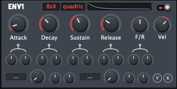
Envelope (open)
This is one of what I’m not pleased with, since this part is too differently designed from others.
Glide & Parametric EQ use the circles for these sub-parameters.
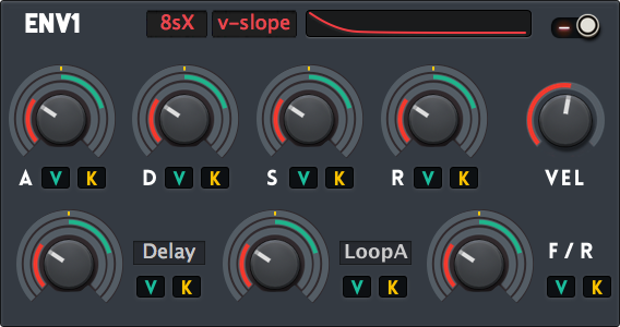
So this time…..
This is better.
Showing “V” for velocity & “K” for keyfollow is just the same as NI Massive so it would be comprehensible.
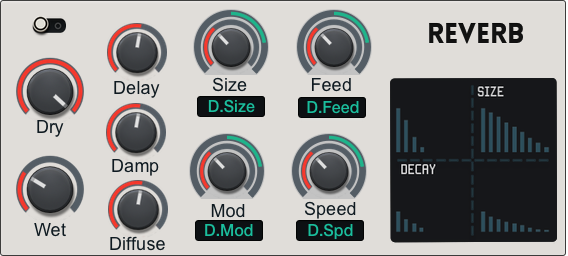
Reverb Module
Reverb, can also adopt the same UI. It can save so much space that I could put XY pad in it.
Top Bar Contents
The top bar still has some space to put something in. There’s a case where you go to ARP pane and find that the voice mode is not “arpeggiator”, so you need to go back to the main pane. What a frustration!
This is better. Icon style voice mode indicator is , just so cute.
Ideas just don’t stop occurring to me!!!!

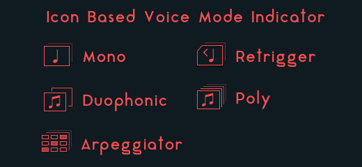

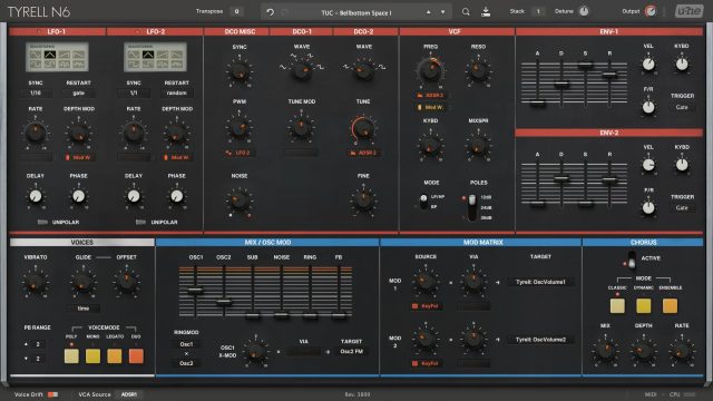
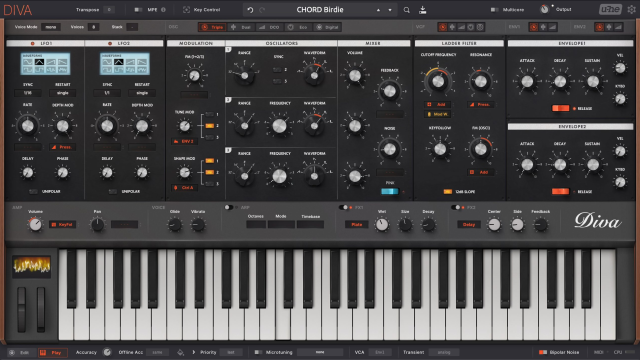

I like the idea of icons, but duo and poly seems close enough to me that I’m able to confuse it.
Hi! Now it’ll never go confusing!! Yeah
I love these skins so much! I had just a couple questions. Is the latest update supposed to contain all of these new features? http://plugmon.jp/future-updates/. I don’t see the new reverb or changes to the voice circuit / top bar.
Also, when I load a D-HCF in ZebraHZ, nothing comes up and there is nowhere to edit the HPF. Thanks!!!
Hi, not all the features has been brought yet.
D-HPFs and VCA comps are hidden by default and can be activated by the button in the HZ module.
It’s explained in the demo movie, but I should have written this in the user guide as well.
Thanks for the feedback.