Massive Modular Skin has just been released, but I’m already planning some features the will come in the future.
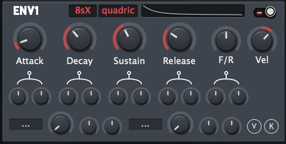
Envelope (open)
This is one of what I’m not pleased with, since this part is too differently designed from others.
Glide & Parametric EQ use the circles for these sub-parameters.
So this time…..
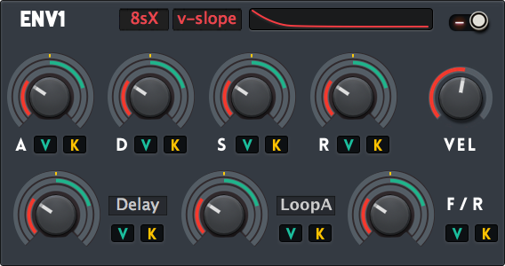
This is better.
Showing “V” for velocity & “K” for keyfollow is just the same as NI Massive so it would be comprehensible.
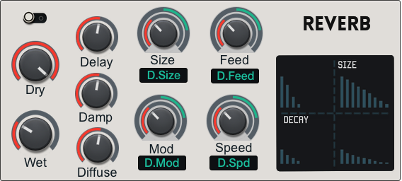
Reverb Module
Reverb, can also adopt the same UI. It can save so much space that I could put XY pad in it.
Top Bar Contents
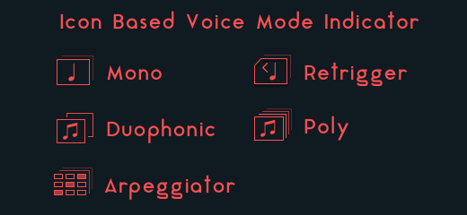
The top bar still has some space to put something in. There’s a case where you go to ARP pane and find that the voice mode is not “arpeggiator”, so you need to go back to the main pane. What a frustration!
This is better. Icon style voice mode indicator is , just so cute.
Ideas just don’t stop occurring to me!!!!
