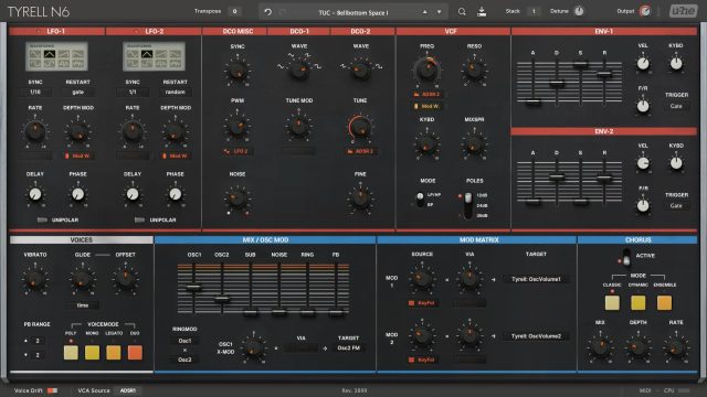
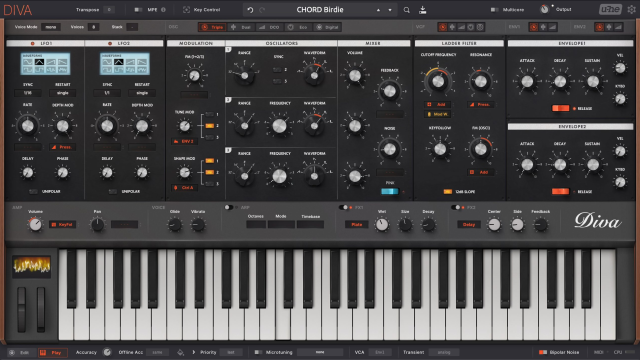
The new style for Pokemod skin has been done!! It’s added to the package. You can update the contents via Gumroad. If you hadn’t associate your account with Gumroad and cannot download, please contact me.
After I had made the original version, I got the feeling that the wooden-decorated modules and moog style knobs are a
bit too much.
Zebra’s character is crystal-clear sound quality and its futuristic modulation system.
So there ought to be another skin that reflects this modern and digital concept well. And this is it.
So the new skin was named “Pokémod Crystal” (not Pokémon Crystal). It keeps some color variations as the former one, but the panel styles are unified — simple rectangles.
Not only this, two new ideas flowed into my mind.
1. Destruct Bottom Tabs
I have to say that I was a bit influenced by the great Zebra theme, “Zebra Redux”.
But doing away with bottom panel is one of the ideas I also thought, actually.
Stuffs in the bottom panel are moved elsewhere.
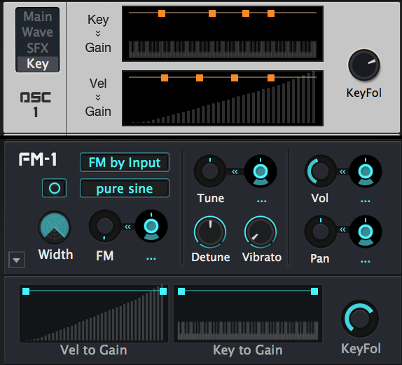
For instance, “Key to Gain” of OSC, FMO are moved to modules itself. Bottom drawer arrow is added to FMO module and you can open / close it.
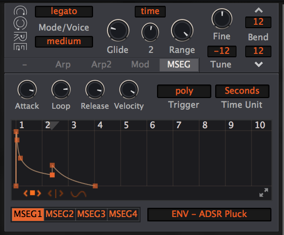
Arpeggiator, MSEG and Mod Matrix are modulators, so it’s quite natural to be in modulator rack.
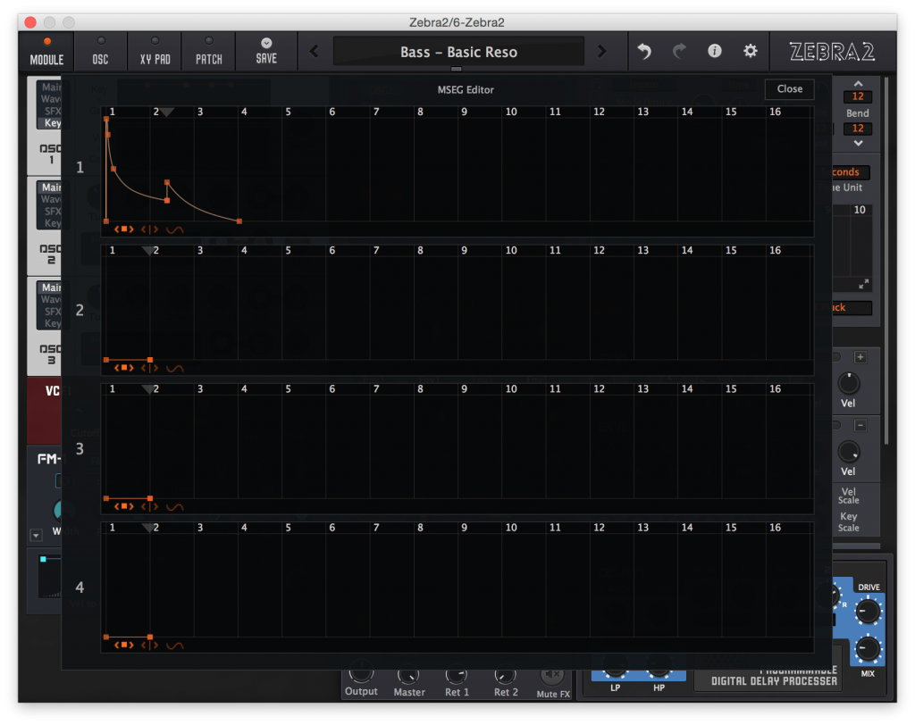
Think MSEG is too small to edit? You can open big MSEG editor.
OSC pane got better, too.
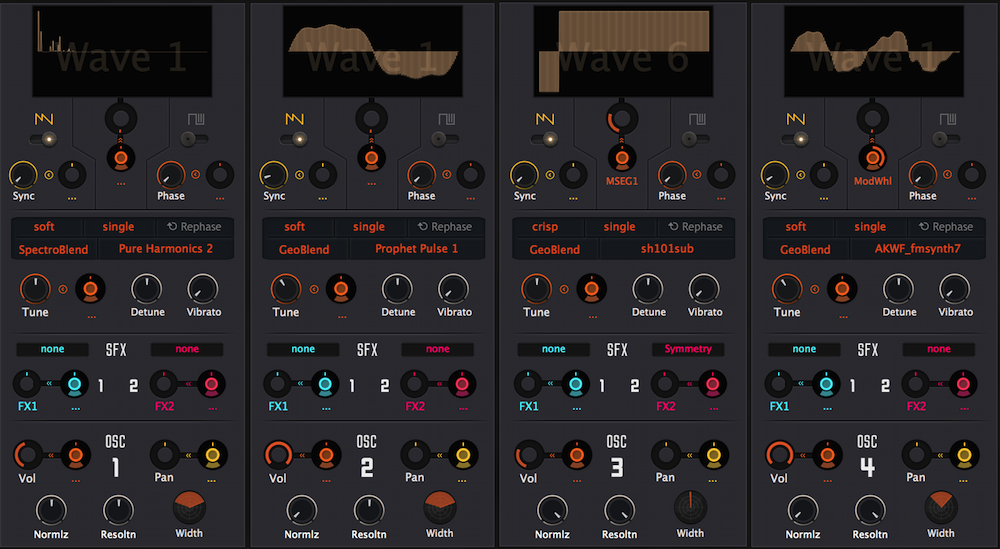
In current theme, OSC panel is just a series of OSC modules. Everything messed up and your eyes moves diagonally it’s uneasy.
So I thought of mixers, almost all of which has clear vertical alignment. Why didn’t I follow that?
This is much clearer. the wave is generated on the top, down then tuning, then effects, finally mixing. You can imagine waves go down to the bottom.
2. Wider GUI (1134px)
Did I came too far? Maybe no one has tried to show multiple effects. But it is possible. It was easy to implement.
At first I tried showing 2 effects, but it’s noncommittal.
Don’t you think so? Most PCs I think have screens wider than 1280px. There’s enough room to display more so why not cultivate.
Wider GUI is definitely awesome. It really tastes like true-modular-synthesis, makes me feel Zebra’s kingdom much expanded.
They’re gonna be released in the future (not finished yet). “No bottom tabs” will be 128DL bonus, and “Wider GUI” will be the 512’s.
512DL. Long way but I believe it’s possible. Now it’s time to advertise…


